When it comes to web design, the devil is in the details—and one of the most crucial details is font pairing. The right combination of fonts not only defines the character of your website but also significantly affects usability, readability, and user experience. With an overwhelming array of fonts available, selecting the perfect duo can be daunting. To simplify your quest for elegance and coherence in web typography, we’ve curated three Google Font pairings that promise to elevate your designs: Fraunces + Open Sans, EB Garamond + Raleway, and Cinzel + Noto Sans.
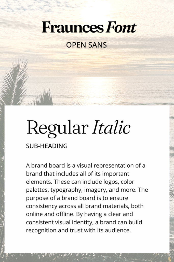
Fraunces + Open Sans: A Balance of Playfulness and Clarity
Fraunces is a variable font that offers a spectrum of weights and styles, characterized by its whimsical serifs that imbue a touch of personality and sophistication. Ideal for headlines and attention-grabbing statements, Fraunces injects charm and uniqueness into your web design.
Pair it with Open Sans, a sans-serif font renowned for its readability across a wide range of screen sizes and devices. Open Sans is the workhorse of web fonts—versatile, neutral, and friendly. This combination brings together the distinctiveness of Fraunces with the clarity and simplicity of Open Sans, creating a web presence that’s both inviting and professional.
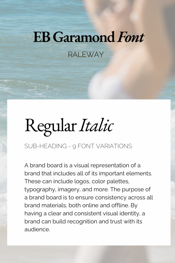
EB Garamond + Raleway: Classic Elegance Meets Modern Minimalism
For those seeking a touch of tradition, EB Garamond is a timeless choice. This serif font, with its refined grace, brings a sense of literary elegance and historical depth to your site, perfect for projects that lean towards the classical or scholarly.
Complement EB Garamond with Raleway, a sleek, sans-serif font that adds a contemporary edge. Raleway’s range of weights offers flexibility in design, allowing for a modern layout that harmonizes with the classic beauty of EB Garamond. This pairing is especially suited for sites that aim to blend the authoritative with the innovative.
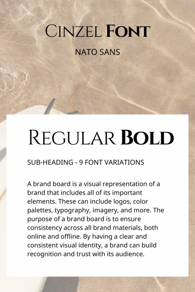
Cinzel + Noto Sans: From Ancient Rome to Global Modernity
Cinzel draws inspiration from the beauty of classical Roman inscriptions, offering sharp and bold serifs that stand out in headings and logos. It evokes authority, tradition, and a timeless aesthetic.
Noto Sans, on the other hand, is designed to support a global vision, offering uniformity in design across different languages without sacrificing character. Its clean lines and open forms make it incredibly readable, perfect for body text.
This pairing marries the historical gravitas of Cinzel with the modern simplicity and inclusivity of Noto Sans, ideal for websites aiming to project authority while remaining approachable and legible to a global audience.
How To Implement Theses Google Fonts
Choosing the right font pairing is only the beginning. To truly bring your web design to life, consider these tips:
- Test Across Devices: Ensure your chosen fonts display well on various screens and resolutions.
- Play with Weight and Style: Use different weights (bold, regular, etc.) and styles (italic, uppercase) to create a visual hierarchy and add interest to your text.
- Know Your Audience: Align your font choices with the tone and purpose of your site. The right fonts can subtly influence how your message is perceived and received.
Final Conclusion
Fonts are the voice of your website, and selecting the right pairings can elevate your design from good to great. Whether you’re aiming for a site that’s sleek and modern or traditional and authoritative, these Google Font pairings offer a starting point for achieving an elegant, standout web presence. Experiment with these combinations and adjust as needed to suit your unique vision and goals. Happy designing!


Thank you so much! this was very helpful for choosing free google fonts.